
THE POWER OF COLOR
How different brands and products use color to their advantage.
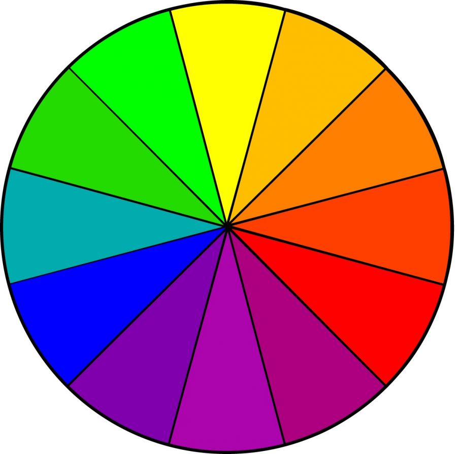
When you look at an item, what is the first thing you notice? The words? How the item is placed? Or would you notice the color, whether it be red, yellow, or another color on the wheel? Some may not be aware, but color is a huge factor in helping us make choices. Companies take advantage of this in their advertisements and products, strategically using certain colors to catch the buyer’s eye. Marketing is everything, and many colors may have more meaning than you think.
Warm Colors:
The colors that are very popular among product advertising are warm colors (red, orange, yellow). These colors are attention-grabbing, made to catch your eye on the shelf, and also works very well on impulse-buyers. Red is used to be bold or intimidating, showing a great deal of passion. Orange and yellow both have similar traits; they convey a sense of youth or high energy, giving off happiness or cheerfulness. On the other hand, they could just as easily stand out as a warning, or alert. Though these colors are very striking, overusing them can be a strain on the eye, forcing companies to be smart on how they use them.
Cool Colors:
Like the warm palette, cool colors (green, blue, purple) are also used quite often by companies, yet they produce a whole different expression. These colors provide a more calm feeling. They may not be the first ones you notice, but they are very easy on the eyes, helping you ease into buying the product. Green is linked with health, finance, or nature. This color is most commonly used with food products. Blue provides a feeling of tranquility or relaxation and, even though the norm is slowly changing, is also seen as a masculine color. The last color, purple, gives off mysterious or imaginative vibes, also commonly tied with luxury. Although these colors don’t get noticed straight away, they are more soothing and often tug on the buyer’s emotions.
Which colors draw your attention when you go to the store?
“Depends on the store. Say I go to Wal-Mart; I see blue, Hot Topic; I see black, Target; I see Red, etc. It all depends on the brand’s main color. The reason is because I associate stores with their respective colors, if that makes sense. All just depends on where I am” – Nate Bancroft, 10th
“For me personally, anything shiny or dark academia looking. So shiny and dark colors (dark greens and purples). There’s a lot of well…color, so that stands out more now. As for the shiny, I’m just ADHD.” – Alyssa Duncan, 10th
“I’m drawn to red. Maybe it’s a human instinct thing, but I just have always loved that color. I feel like advertisements and such will use colors that pop, like red, to draw your eye. So even colors like yellow and pink can be very alluring, but red goes back farther than most colors and always draws my attention.” – Bruce Bowen, 10th
Companies are smarter than we may perceive them to be, using color to persuade unaware customers to buy their products. But that’s just how they cast their hook. You might find many points of time where you impulsively buy an eye-catching product, never knowing the trick.

Hi! My name is Jessica and this is my first year as a Staff Writer for iHoot. I'm 15 years old and this is my 2nd year at IUPrep as a sophomore. I also...